Eng
Eng

Man and Culture
Reference:
Ermakov , E.V. (2025). Graphemes as a structural element of the design of subway schemes. Man and Culture, 2, 165–174. . https://doi.org/10.25136/2409-8744.2025.2.73478

|
Library
|
Your profile |
 This work is licensed under a Creative Commons Attribution-NonCommercial 4.0 International License.
|
Man and Culture
Reference:
Ermakov , E.V. (2025). Graphemes as a structural element of the design of subway schemes. Man and Culture, 2, 165–174. . https://doi.org/10.25136/2409-8744.2025.2.73478
Graphemes as a structural element of the design of subway schemes
DOI: 10.25136/2409-8744.2025.2.73478EDN: OZBRHQReceived: 24-02-2025Published: 03-05-2025Abstract: The focal point of this study pertains to the role of fundamental structural and compositional elements of infodesign of transport schemes, which collectively influence the viewer's perception of visual language. These elements have been delineated as 'graphemes'. The analytical framework encompasses their structural components, the functional role they play in navigation, the aesthetic principles that govern the organization of scheme space, and the cultural-semiotic significance that reflects local identity. A particular focus of the study is the interaction of graphemes with the user, exploring how their shape and composition influence information perception, emotional response, and navigation facilitation within the context of urban transport systems. The objective of this study is to explore the role of 'graphemes' in the design of transport schemes, and to attempt to develop a methodology of approaches to the introduction of certain symbols or signs into the design of metro schemes, taking into account their cultural, functional and aesthetic criteria, expressed in our own interpretation of the St. Petersburg metro scheme based on this approach. The research was conducted using the following methods: information design, semiotics and psychology. These methods included prototyping, comparative analysis, case study and narrative method. The results of the study confirm that the integration of graphemes increases the intuitiveness of the systems and their cultural adaptation strengthens the identity of the urban environment. Using the author's interpretation of the St Petersburg metro scheme as an example, it is shown how local symbols (e.g. historic buildings) can be organically integrated into the design. The following necessary steps for further research are highlighted as prospects: testing the proposed solutions through sociological surveys of passengers to assess their practical effectiveness; developing flexible methods for scaling 'graphemes', taking into account the expansion of transport networks and changes in the urban context. Keywords: grapheme, navigation system, subway, subway scheme, sign, infodesign, infographics, prägnanz, design semiotics, symbolThis article is automatically translated. You can find original text of the article here. Introduction In the traditional sense, a grapheme is a linear–axial structure of a letter mark or a minimal unit of written speech corresponding to a phoneme in spoken speech. In the context of studying information design, the question arises whether a similar structural organization should be integrated into the design of transport schemes, considering the navigation scheme itself as a sign. In the framework of this study, a grapheme will be understood as a sign formed by the lines of the diagrams of subway lines and other transport systems, which is a kind of "skeleton" of the map, perceived by the viewer before its direct content. The first use of the term grapheme in this context is found in Ilya Birman's practical guide "Design of transport schemes". The relevance of this study is due to the fact that studying the role of graphemes as structural elements of navigation scheme design can play an important role in forming a convenient and functional approach to their design, as well as positively influence the perception and experience of using schemes by passengers. The purpose of this study is to study the role of grapheme in the design of transport schemes, as well as an attempt to develop a methodology for approaches to the implementation of certain symbols or signs in the design of the metro scheme, taking into account their cultural, functional and aesthetic criteria, expressed in their own interpretation of the St. Petersburg metro scheme based on this approach. Currently, issues related to the semiotic approach to the study of cartography and information design are poorly understood in the scientific community. This problem is partly reflected in scientific works on the semiotics of design, thematic cartography and visual communication systems by E. V. Zherdev, A.V. Ikonnikova, N. I. Barsukova, V. S. Pavlov, O. G. Novichkova, N. I. Natus, D. A. Potapov and others [1, 3-5, 7-9], where the authors explore the theory of signs and communication systems, as well as their implementation in the field of information design, but the role of the organizing symbol (grapheme) in the context of navigation infographics is practically not considered. The object of this study is the design of subway schemes, and the subject is the role of graphemes as an information design tool for transport schemes. The material for the study was 12 current subway schemes in the following cities: Moscow, Nagoya, Beijing, London, Cleveland, San Francisco, Paris, Barcelona, Madrid, New York, Mexico City, and St. Petersburg. Research materials and methods 12 metro schemes from different cities of the world served as the material for this study. The selected schemes were divided into two main categories: those that include graphemes, and those that do not have such organizing elements at their core. This separation made it possible to conduct a visual analysis, identify the grounds for the use of graphemes, and evaluate their contribution to the overall readability of the schemes. The research was conducted using information design methods, fundamentals of semiotics and psychology, including prototyping, comparative analysis, case study, and narrative method. A comparative analysis revealed the differences between the two categories of schemes, which allowed us to determine which elements and shapes are most effective in their design. The narrative method, in turn, made it possible to interpret the data obtained during the analysis of the schemes. Prototyping was used to explore the possibilities of graphemes in simplifying navigation through complex metro schemes using the example of the St. Petersburg metro. Results In the context of route scheme design, a grapheme can be considered as a fundamental element of their structure, performing the function of a sign. Within the framework of semiotics, a sign is an object that is perceived by visual analyzers, and also transmits certain information. Thus, a grapheme can play the role of not only a structuring compositional element in a scheme, but also have a semantic meaning at its core. According to a study by E. V. Zherdev, who studied the relationship between composition and metaphorical imagery in design, when a person perceives a design object through associative connections, a primary impression appears in the first seconds of interaction, which allows him to evaluate this object both positively and negatively from the point of view of aesthetics [3]. At the same time, T. A. Putintseva's research shows a tendency to simplify the representation of signs, which contributes to the formation of various associations due to the greater space for the viewer's imagination. This leads to a wider application of such a graphic design technique as "fragmentation", which consists in the fact that individual design elements have their own meaning, but when combined, a new meaning is formed, different from the original ones [10]. Consequently, the application of the principles of semiotics in design makes it possible to take into account both aesthetic and semantic aspects in the study of graphemes in subway schemes. In the context of this study, an analysis of the subway schemes of the following cities was carried out: Beijing, Nagoya, London, Moscow, Cleveland, San Francisco, St. Petersburg, Barcelona, Paris, New York, Madrid, Mexico City. This choice was due to the need to study different approaches to cartographic design in the context of urban navigation in different cities of the world (see Figure 1). Analyzing the presented schemes, we have identified two main types of composite solutions. The diagrams located in the first line demonstrate the presence of a pronounced central axial element, which serves as the organizing principle of the entire composition. In contrast, the schemes of the second line are characterized by a more complex and less ordered structure, where there is no clearly defined central element, which makes it difficult to perceive complex information.
Figure 1 of the subway scheme Fig.1 Subway schemes The further simplification of the schemes, carried out by designer Peter Dovak by removing station names and secondary information (see Figure 2), makes it possible to see more clearly the basic compositional principles underlying each of the schemes (Dovak P. Mini Metros URL: https://www.behance.net/gallery/42513037/Mini-Metros ). So, in grapheme schemes, one can observe either a clearly traceable geometric shape formed by a circular line (examples of the cities of Moscow, Nagoya, Beijing, London), or a shape created by crossing broken lines, which is associated with the image of a human figure or symbolic sign (Cleveland, San Francisco).
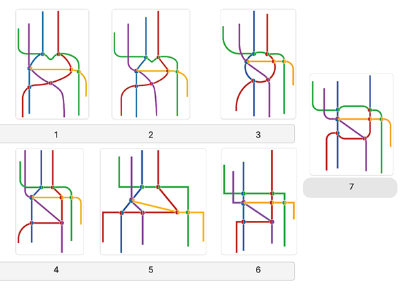
Figure 2 Simplified subway schemes Fig.2 Simplified subway schemes The first group includes the schemes of the following cities: Moscow, Nagoya, Beijing and London. On the Moscow and Nagoya metro diagrams, the grapheme is an annular line, represented as a circle. The circle, as a basic archetypal image in design, symbolizes integrity, continuity and dynamism [6], which helps to maintain the compositional structure and facilitates orientation in the space of the scheme, forcing the viewer's gaze to move along the ring and concentrate on the compositional center of the scheme. As part of the design of the Beijing Subway scheme, a different approach is used to visualize ring lines: they are represented as geometric shapes with right angles (square and polygon). This geometric shape is associated with stability, stability and rationality [6], which is dictated not only by topology, but also by the cultural and historical context, since in the center of the diagram is a symbol of Chinese history - the Forbidden City, the geometry of which also obeys the shape of a square. On the London Underground diagram, you can highlight another grapheme - a polygon resembling the shape of a bottle lying on its side. This element performs the function of a compositional core, highlighting the urban center, around which other, more chaotic and disparate lines are organized. An analysis of the subway maps of the cities of Cleveland and San Francisco revealed the absence of ring lines, but the general configuration of the lines in these diagrams may be associated with human silhouettes. On the Cleveland metro map, the lines are arranged in such a way that they create an association with a falling person, while on the map of San Francisco, the lines resemble the figure of a man with his hands joyfully raised up. The contrasting lines in these diagrams and the specific angles of their inclination contribute to the formation of an expressive and memorable image. This facilitates the process of visual perception and allows passengers to more easily assimilate and reproduce from memory the structure of the subway scheme. In the context of communicative design and semiotics, an analysis of the subway schemes of the following group of cities, including St. Petersburg, Barcelona, Paris, New York, Madrid and Mexico City, reveals the absence of central axial elements in the compositional structure of the map. This absence leads to the creation of visually overloaded and difficult-to-perceive circuits, where navigation is complicated due to the high density of heterogeneous information. Such a circuit design may be due to the unique topology and individual characteristics of the subway lines of each city. However, the key task of a metro circuit designer is to transform any topology and line layout into a more readable and orderly form, therefore, the design of these circuits can be improved. As part of the research, alternative design concepts for the St. Petersburg metro scheme were developed. The main emphasis was placed on the development of grapheme as a central compositional element, which is absent in the modern scheme. As a result, seven conceptual variants of graphic symbols for the St. Petersburg metro scheme were created (Figure 3). The first two variants are graphemes located in the central part of the diagram, which silhouetted resemble raised bridges — the iconic symbol of St. Petersburg, as well as the metro logo in the form of the letter "M" (graphemes 1, 2). The remaining five variants demonstrate graphemes in the form of geometric shapes: a circle (grapheme 3), a trapezoid and square (grapheme 4), trapezoid (grapheme 5), as well as variations of the square (grapheme 6-7). These strict geometric shapes visually correlate with the architectural traditions of classicism, characteristic of the historical buildings of St. Petersburg.
Figure 3 Grapheme development based on the St. Petersburg Metro scheme Fig.3 Development of a grapheme based on the scheme of the St. Petersburg metro
Discussion As a result of the comparative analysis, it was revealed that the use of such structural elements as graphemes greatly simplifies the process of orientation in the scheme, and also creates a more understandable and memorable symbol for the user. Of the developed grapheme variants based on the St. Petersburg metro scheme, three were chosen as the most successful (graphemes 2, 3, 7). Grapheme 2 combines rounded and broken lines, promotes easy memorization due to the formation of an associative connection with the metro logo and the symbol of the city – raised bridges. Grapheme 3 is perceived not only as a visual accent highlighting the city center due to the circle, but also conveniently shows transfer options between different metro lines. Grapheme 7, whose shape is a square with rounded corners, combines the convenience and emphasis of grapheme 3, and also reflects the classicism of the architecture of the city center, or can be associated with the famous courtyards-wells. The proposed symbols not only reflect the cultural peculiarities of St. Petersburg, but also simplify navigation by using simple signs and forms, which follows from such a principle of perceptual psychology as the law of precedence proposed by M. V. Wertheimer, according to which integral and complete forms are better captured by perception when they are characterized by internal organization, symmetry, and clear boundaries. and balance, as well as similarity to simple geometric shapes [2]. Consequently, graphemes may have different structures and symbols at their base, but their presence optimizes the interaction of passengers with the metro scheme, which corresponds to the main goals of the information design. Conclusion Thus, graphemes play an important structural role in the design of subway circuits. The integration of graphic symbols not only simplifies interaction with the scheme, but can also reflect the historical and cultural symbols of the city. The interdisciplinary approach in the study made it possible to justify the introduction of such a term "grapheme" by linking design and semiotics, as well as considering information design objects as sign systems. As a result of the analysis, further research of grapheme implementation options using sociological surveys of subway passengers is recommended. It is also necessary to develop an approach to the use of graphemes, taking into account the possible scaling of the metro network. References
1. Barsukova, N. I. (2022). Semiotic functions of figurative-associative forms of design in urban environment. Bulletin of Slavic Cultures, 65, 359-371.
2. Wertheimer, M. V. (1987). Productive thinking (S. F. Gorbov & V. P. Zinchenko, Eds.; V. P. Zinchenko, Introductory article). Progress. 3. Zherdev, E. V. (2005). Features of the interaction between composition and metaphorical imagery in the context of design semiotics. Bulletin of OGU, 1, 73-82. 4. Ikonnikov, A. V. (1989). Design of transport systems: Some problems of integrated design. Technical Aesthetics, 57, 60-74. 5. Laptev, V. V. (2014). Thematic cartography as a special direction of information design. International Journal of Cultural Studies, 3, 85-92. 6. Makhlina, S. T. (2018). Communicative features of design semiotics. Bulletin of St. Petersburg State Institute of Culture, 2, 14-18. 7. Novichkova, O. G., & Natus, N. I. (2014). Design of navigation systems as one of the areas of contemporary design. Tsarskoye Selo Readings, XVIII, 180-183. 8. Pavlova, V. S. (2011). Features of the application of semiotics in graphic advertising design. Almanac of Theoretical and Applied Research in Advertising, 1, 81-92. 9. Potapov, D. A. (2023). Graphic design in the optics of semiotics and interpretive sociology. St. Petersburg Sociology Today, 19, 49-59. 10. Putintseva, T. A. (2015). Technologies for finding creative solutions in the design of "Symbolic Forms". Bulletin of OGU, 5, 57-62.
First Peer Review
Peer reviewers' evaluations remain confidential and are not disclosed to the public. Only external reviews, authorized for publication by the article's author(s), are made public. Typically, these final reviews are conducted after the manuscript's revision. Adhering to our double-blind review policy, the reviewer's identity is kept confidential.
Second Peer Review
Peer reviewers' evaluations remain confidential and are not disclosed to the public. Only external reviews, authorized for publication by the article's author(s), are made public. Typically, these final reviews are conducted after the manuscript's revision. Adhering to our double-blind review policy, the reviewer's identity is kept confidential.
|